Faceless YouTube: The 300% CTR Thumbnail Strategy
Stop losing the "3-Second War." If your CTR is under 5%, your channel is actively bleeding cash; here is how to fix it today.

Let’s face a brutal reality. When you run a Faceless YouTube channel, your thumbnail isn’t just an image. It is your ultimate salesperson, your digital storefront, and frankly, your only lifeline.
If you lose the microscopic “3-Second War” on the homepage feed, your video practically doesn’t exist—no matter how good the editing is.
I recently dropped a rapid-fire version of this on X, but here is the expanded, 0.1% Thumbnail Blueprint that reliably spikes Click-Through Rates (CTR) by 300% or more:
1. Engineering the “Visual Hook” (Since You Don’t Have a Face)
Human neurology is hardwired to seek out faces. Without a host on screen, you don’t have that biological advantage. You are forced to rely on aggressive “Pattern Interrupts.”
Running a finance channel? Do not use a generic stock photo of a dollar bill. Show a literal $100 bill going up in flames.
The Math: Aim for a minimum 4.5:1 contrast ratio. If that image doesn’t practically burn through a glaring iPhone screen on a sunny day, throw it out.
2. The Curiosity Gap (The 40% Rule)
Your thumbnail text should NEVER just regurgitate your video title. It has to act as a multiplier.
The Hard Limit: 3 to 4 words, maximum.
Instead of writing: “How to Save Money.”
Write: “The $10,000 Mistake.”
You are creating an “Open Loop” in the viewer’s brain. Psychologically, they will feel compelled to click just to close it.
3. The Rule of Thirds & Fabricated Trust
Amateurs center everything. Stop it. Position your “Hero Object” directly on the intersection lines of the rule of thirds.
Pro Move: Blur the background and keep your main subject razor-sharp. This mimics “Portrait Mode” photography, which the human eye subconsciously links to high-quality, premium production. It immediately lowers the friction to click.
4. Stealing from the Kings of the Click
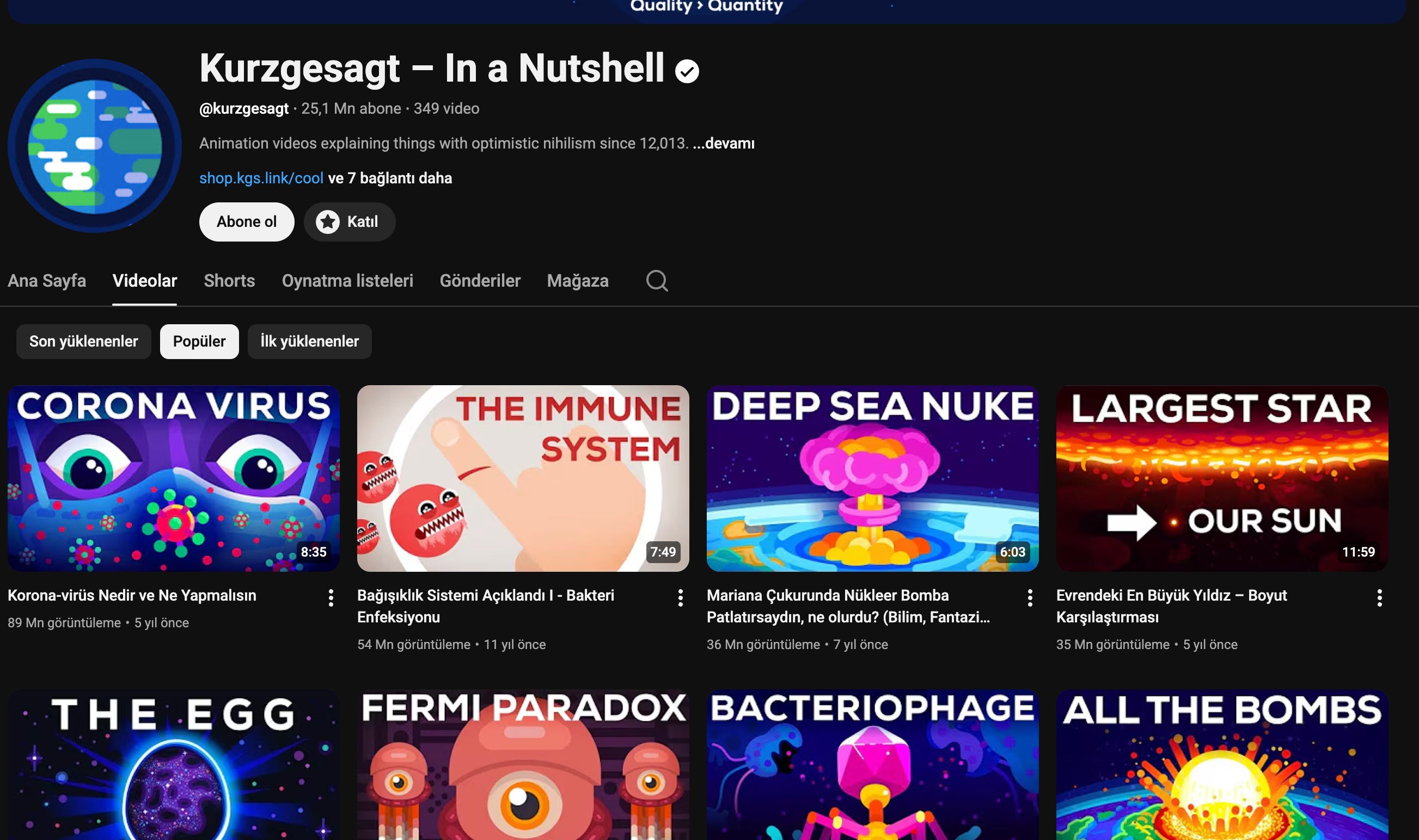
Kurzgesagt (25M+ Subs): They deploy a relentless “Flat Design” art style. You know it’s their video before you even read the text. That is what we call an impenetrable “Brand Moat.”
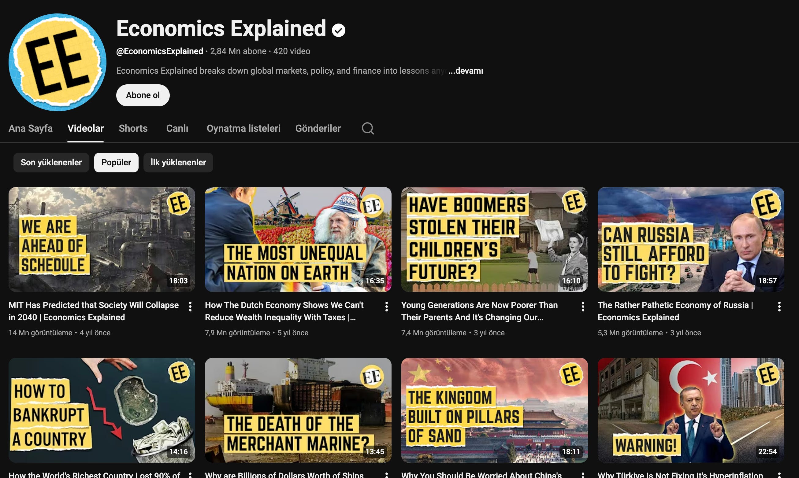
Economics Explained: They are masters of “Simplified Complexity.” High-contrast graphs paired with massive red arrows. They promise a massive Epiphany in exchange for a micro-commitment (the click).
5. The 2026 AI Leverage
Manual graphic design is a massive bottleneck. You need to be using Midjourney or specialized custom GPTs to print 50+ variations of a single concept in seconds.
The Elite Play: Don’t waste time A/B testing a blue background vs. a red one. Use YouTube’s native “Test & Compare” feature to pit two entirely different CONCEPTS against each other. Let the market vote with their clicks.
The Bottom Line:
A 10-minute video with a garbage 2% CTR will ALWAYS lose to a mediocre 5-minute video with a 10% CTR. The YouTube algorithm worships the “Satisfaction Signal,” and that entire chain reaction starts with the click.
Optimize your inputs. Monopolize the attention.
Want to master the exact systems that build cash-flowing faceless channels while you sleep?
Hit reply to this email with the word “YOUTUBE” (or drop it in the comments below if you’re reading on the web). I’ll personally reach out and we’ll map out a custom growth architecture for your channel.